A Little Dose of Yellow
Alyssa was right about me in her latest blog post. I am a believer in incorporating at least a splash of yellow into every color scheme. What’s not to love about yellow? It’s the color of sunflowers, butterflies and moonlight. As Vincent Van Gogh said, “How wonderful the colour yellow is. It stands for the sun”. And how about a little Cold Play? Look at the stars, look how they shine for you … yeah they were all yellow.
Last week my friend Claire Oldham shared a beautiful Instagram post about the color yellow and its very personal meaning in her life. Ever since then I’ve been thanking God for creating in full color. I’ve been reflecting on why I’m so drawn to this color and what it stands for in my own life – beauty and warmth and joy and all that is vibrant.
So many of my childhood summer memories are painted in golden hues. Catching fireflies, campfires, the sun setting behind my grandparents’ lake house, the bright yellow shag carpet in our “midcentury modern” living room. As a teenager in the 70s, I decorated my bedroom in bright yellows and greens. It was my happy place, the place of giggly girl sleepovers, laying on giant pillows on the floor singing along to Elton John on the record player, summer afternoon naps, way-too-long phone calls about nothing at all. The colors I surrounded myself with were a reflection of the hope and idealism I felt within.

Those days are long gone but the same colors still make me smile. As one whose time is now equally distributed between the counseling room and various decorating projects, I’m convinced we are deeply impacted by the spaces we inhabit. There’s a trend in my counseling practice I’ve noticed over the last few years. It is that my schedule slows significantly during the summer months. I believe the explanation is delightfully simple. People are less depressed and anxious when the sun is shining and flowers are blooming. Life in full color happens easier in the summertime.

Since yellow is such a personal favorite, I decided to do a little research into color psychology. I learned it is the brightest, most visible color on the spectrum. It captures our attention more than any other color, which is why yield signs and caution tape are displayed in bright yellow. It’s the color of optimism, energy, creativity and happiness. It has the power to lift moods and energize a tired soul. And yet, a little bit goes a long way. Too much yellow – or the wrong shade - can actually heighten feelings of aggression, anxiety and frustration. Because it’s such a powerful stimulant to the human eye, it can easily be overdone.
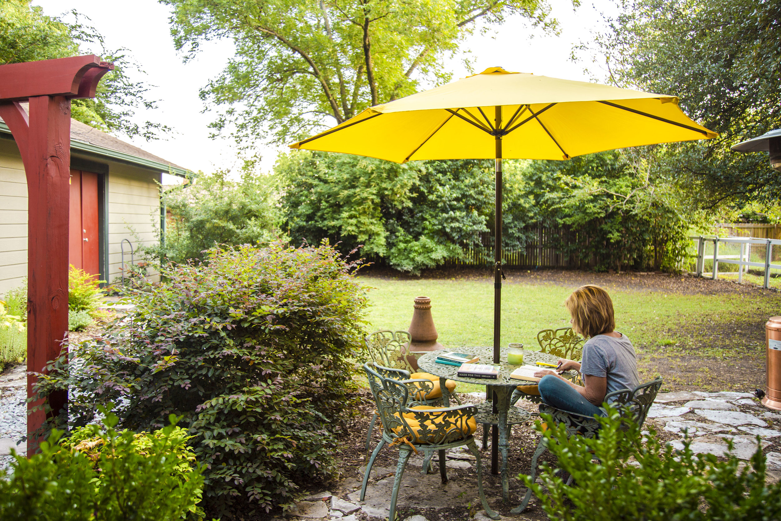
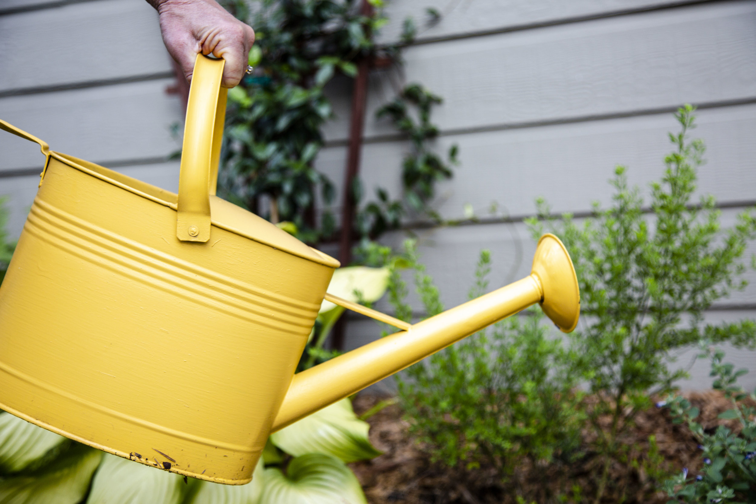
My word for the year is beauty. In keeping with this theme I’m sharing some midsummer happiness right here, posted to inspire you to put a splash of color into your favorite spaces. If you’re not a fan of yellow – it’s ok! Find the colors you love and use them generously. The Creator has lavished us with color throughout nature. We don’t have to live in black and white and gray. We get to splash vibrant color into our lives and feel the way it nourishes our souls.


Someone said we’re most like our Creator when we create. So grab a paintbrush or some gardening pots or some bright-colored fabric – and go color your world!
♥Jana